Policymakers are reluctant to change their minds when it comes to complex subjects like climate change, even when they’re presented with data that contradicts their preconceived notions.
But new research shows that in some cases, it’s possible to sway them with just the right presentation of that data.
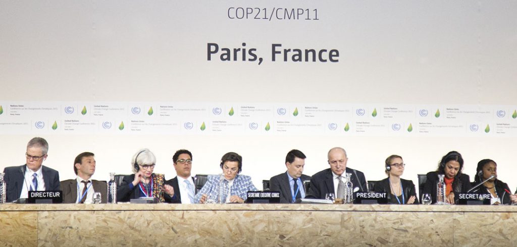
In a recent study co-authored by David Budescu, Ph.D., Fordham’s Anne Anastasi Professor of Psychometrics and Quantitative Psychology, 217 policymakers who attended the 2015 United Nations Climate Change Conference in Paris were asked to predict how much global temperatures will increase by the year 2100.

In a control study, a group of MBA students were recruited and asked to predict the same question.
The question was put to both groups before seeing three different graphical depictions of predicted temperature increases from data gathered from 30 climate models, and again after they viewed each graph.
Budescu said the idea was to see if policymakers and climate negotiators—who tend to use scientific information in a very conservative way and rarely allow it to influence their beliefs—might reconsider their perspective if the same information were presented to them in different formats.
In “COP21 Climate Negotiators’ Responses to Climate Model Forecasts,” a paper published in 2017 in the journal Nature Climate Change, Budescu and his co-authors show how one graphical model proved more persuasive than the other two.
One graph was a boxplot that covered 90 percent of the predicted temperatures from the 5th to 95th percentile of the data; The second graph was the same boxplot but also showed the extreme data points outside the 90 percent range of predicted temperatures; The Third graph contained the same boxplot but also included all 30 data points (inside and outside of the box).
The original judgments of the two groups were highly similar, but the MBA students, who had no preconceived notions about the subject, updated their beliefs about future temperature increases after seeing each of the model predictions. But policymakers were largely unconvinced.
It was only the last format, with more detail, that convinced some policymakers to alter their predictions of future temperature increases, even though all three graph presentations illustrated the temperature increases.
Budescu and his team hypothesized beforehand that policymakers would resist changing their perspective after viewing the first two graphs. Their hypothesis was that the less-detailed presentations would be associated with less credible information by the policymakers, who might then assume the information presented didn’t merit their reconsideration.
He said that the study was geared toward climate change because the issues are a uniquely challenging one for policymakers to grasp.
“They need to make decisions based on models that predict rises in global temperatures that are inherently uncertain,” he said.
The same lessons can be applied for any complex topic in need of straightforward answers, where presentation makes a difference in persuasion, said Budescu.
“Quite often the decision about how to present information is not done by persons who have an expertise in communication. It’s often people who are scientists or lawyers. They’ll say “Here’s the data, we’ll present it to them, and if they are smart and they understand what’s best for them, they will figure it out,’” he said.
But that’s a naïve assumption, he said.
“You can have first-rate data, but if you cannot communicate it in a way that the recipients of the information will understand and digest, then the data will not have the impact you’d would like it to have.”

